PDX Women In Technology (PDXWIT)
ADS
—
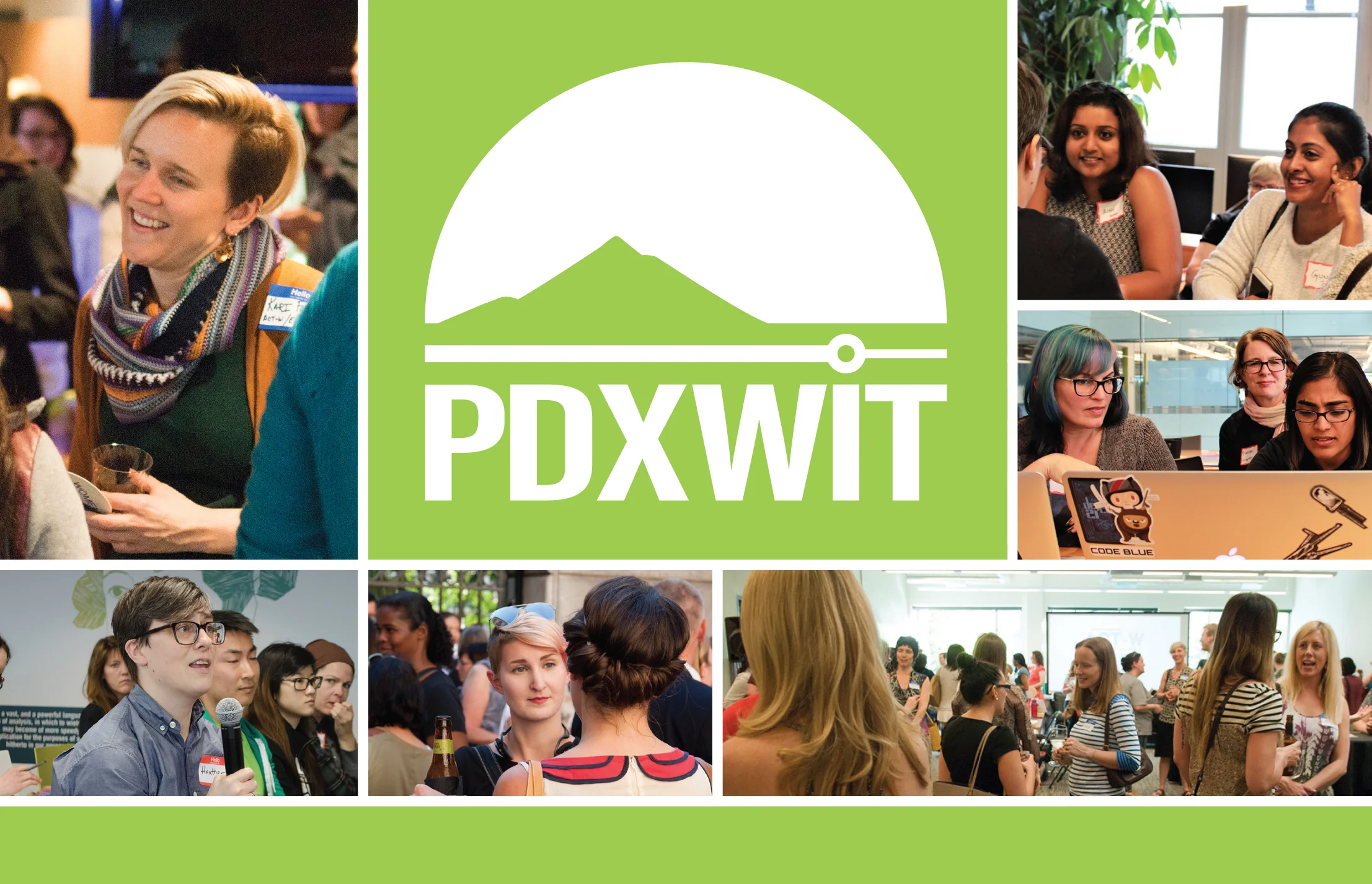
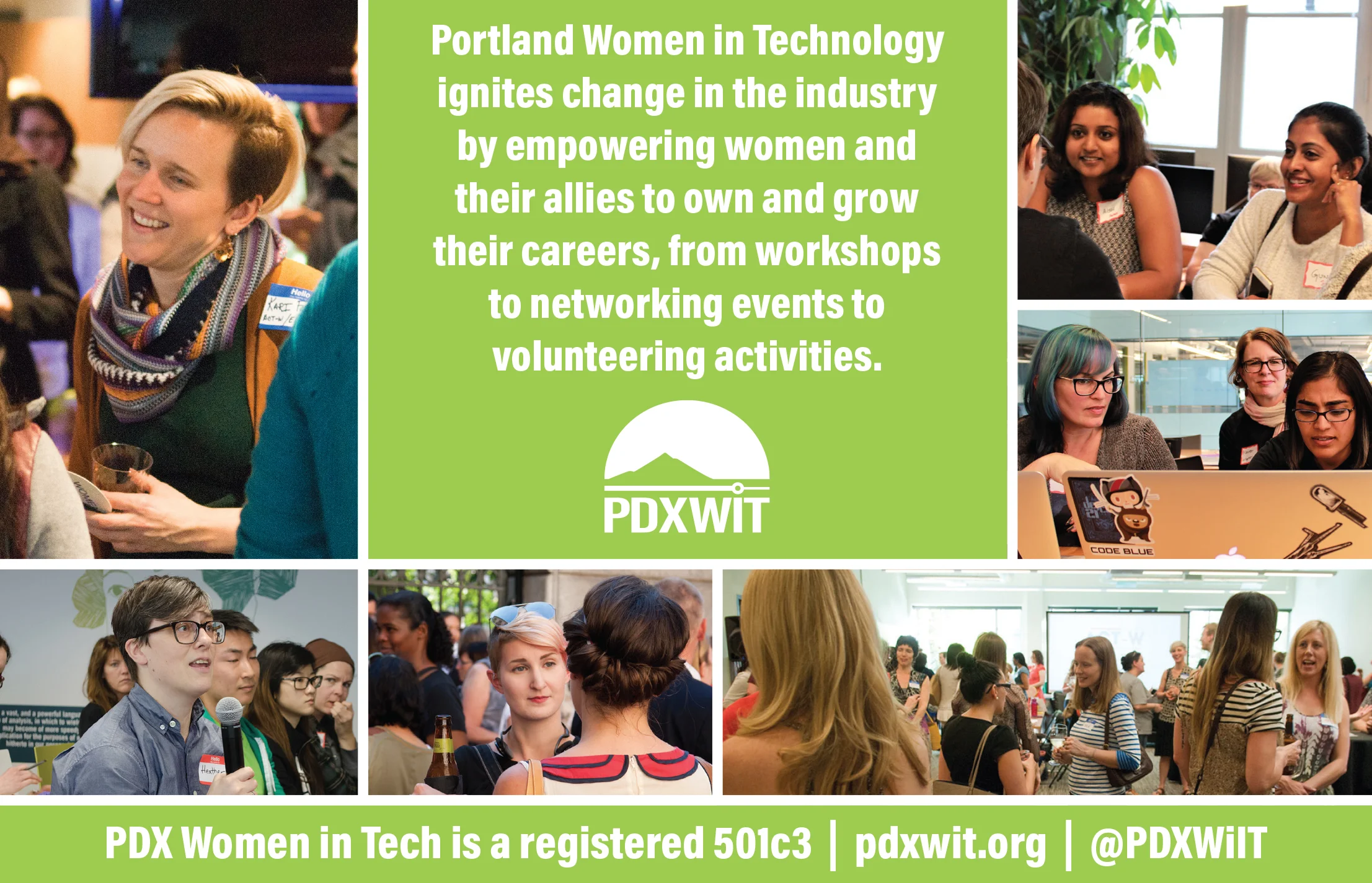
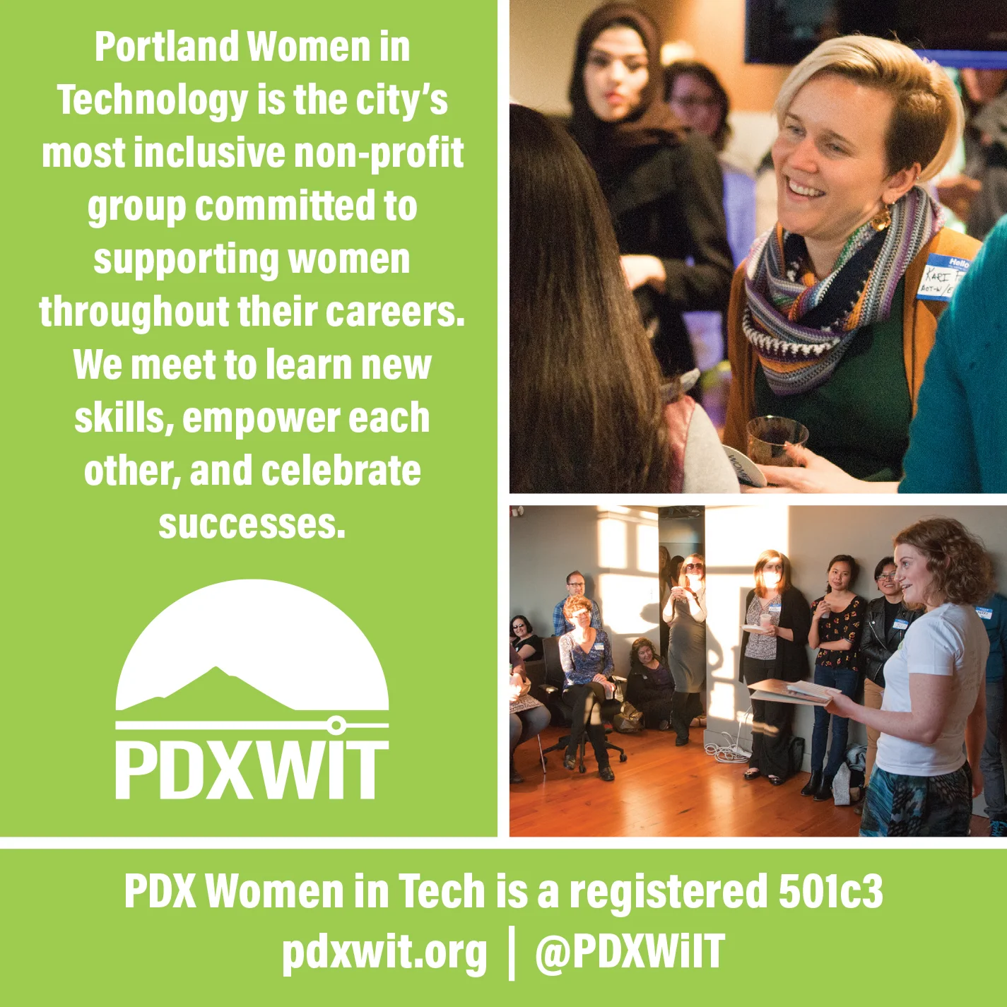
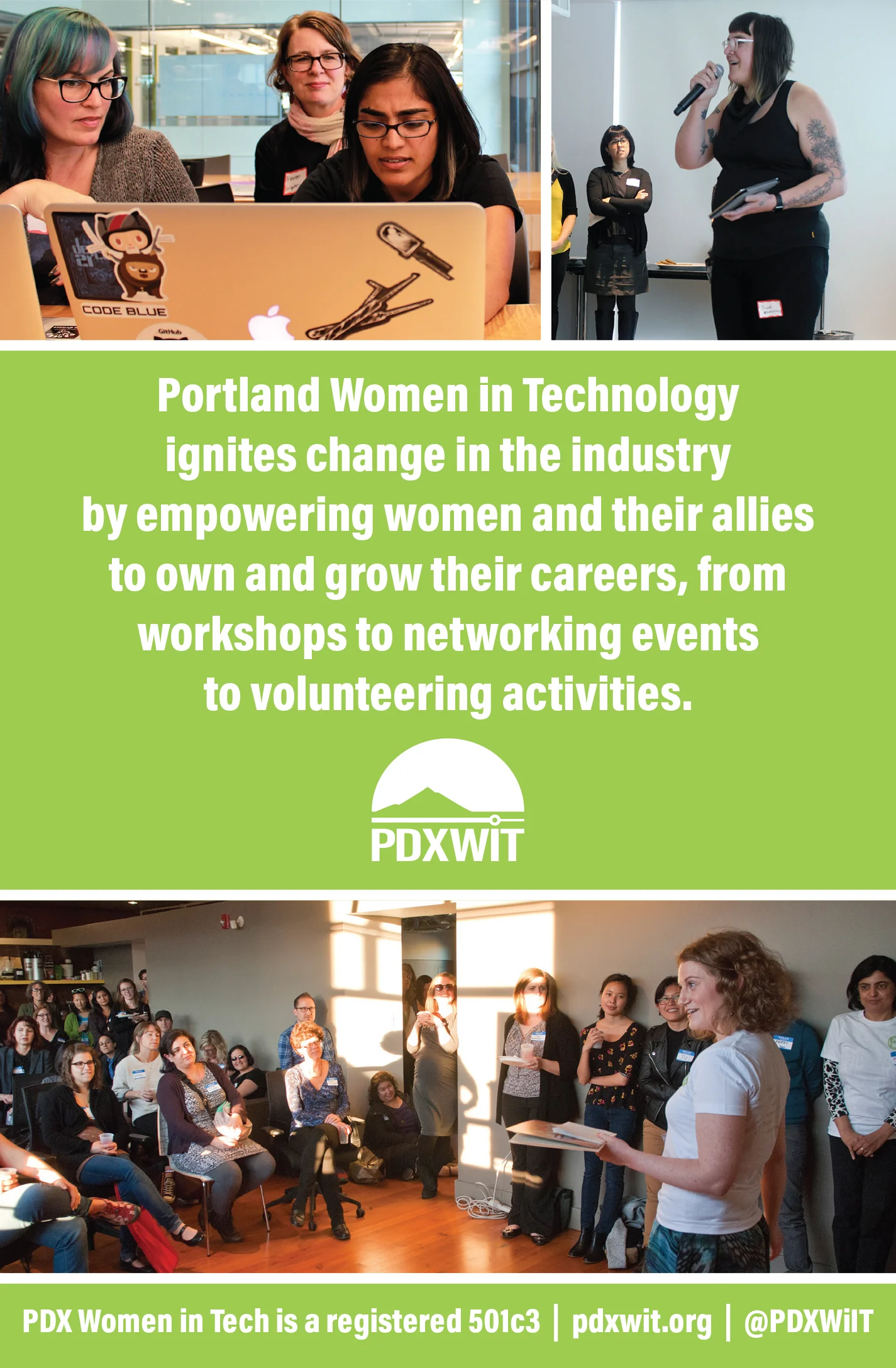
PDXWIT is an organization who supports and celebrates those who identify as women, non-binary and underrepresented people in tech.
PROJECT BRIEF
As the non-profit grew and became more visible, we were approached by Portland Monthly to provide filler ads to use when space allowed. The design brief asked that we create inclusive ads that would look beautiful in print.
We started out simply, beginning with the grid concept for the overall look. I developed a few ideas with the idea of fire and excitement as a theme. That idea was scrapped and we decided on using the simplistic grid look because it looked best on printed material. The ads also looked good online as well.
The non-profit is inspired by inclusion, diversity, technology, and the beautiful state we live in, using that as the basis, it was easy to find a good concept.
FUN FACTS
Being a part of the PDXWIT community has been such a great experience for me. During the development of the ads, we were able to utilize the newly created Slack Channel for immediate changes. My creative director was thrilled with how the ads looked and I was able to see one of the ads in the wild while at the dentist's office!
THE FINE DETAILS
TIMELINE: Project began in 2016
ROLE: Graphic Designer, Design Lead
SCOPE: Advertising Design, Ads developed for Portland Monthly magazine.
TOOLS: Adobe Illustrator, Adobe Photoshop, Adobe InDesign
ASSETS: AIs, PDFs, PNGs
AD VARIANTS
Within the creative brief, we were asked to create multiple different sizes of the ads so Portland Monthly could use them as needed and if they had space. It was interesting to have specific print related requirements as I hadn't worked within the print world in a long while. It did require a couple iterations, but it felt like I was tapping into some knowledge that I had locked away for a while.
The required sizes were:
2.25" x 9.75"
4.75" x 4.75"
4.75" x 7.25"
7.375" x 4.75"
2.25" x 4.75"
4.75" x 2.75"
4.75" x 9.75"
Full page
Each size had a artwork safe area, a trim, and a bleed of 0.125". I really enjoyed this project and felt confident that I would be able to make something really cool and print ready.
OUTCOME & RESULTS
Creating variants of the ads was really quite challenging as each of them had very specific safe art areas that I had to adhere to. I believe it was successful and I even was able to see the ad within the magazine a couple months later.
CREDITS
Client: PDXWIT | Megan Bigelow
Creative Director: Adrienne Barnett
Graphic Design Lead: Meghan Lewis
©PDXWIT | www.pdxwit.org